


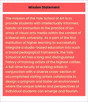
Overview
The Yale School of Art is a graduate school that confers MFAs in Graphic Design, Painting/Printmaking, Photography, and Sculpture; and offers undergraduate-level art courses to Yale College students.
Source: Yale School of art website

What I found interesting!
The website exists as an ongoing collaborative experiment in digital publishing and information sharing. It functions as a wiki—all members of the School of Art community have the ability to add new, and edit most existing content.
Last edited by: Lindsey Mancini and edit access it to everyone
Defining Problem Statement
I deeply value the Yale School of Art's commitment to fostering an open environment where the design community can contribute and maintain the creative essence integral to its purpose. However, I believe that refining the website's design to alleviate chaos, clutter, and information overload while enhancing intuitiveness and organization would significantly enhance user experience. Simplifying the layout and streamlining information presentation would not only align with the School's artistic ethos but also ensure that visitors can engage with its offerings seamlessly and effectively.
How might we design a user-friendly website for the Yale School of Art that caters to individuals of all ages and backgrounds, allowing for easy navigation for both young students exploring college options and older adults seeking information for their children, while also facilitating experimentation with design elements by the art community, all while maintaining accessibility and functionality?
WHAT DID I DO?
Heuristic Markup

Competitive Analysis
User Survey
Empathy Mapping
Sketch and Iterate


Highlighting the issues
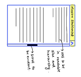
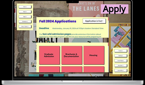
I conducted a heuristic markup exercise to identify potential issues users could face. Through this, it became apparent that there's a deficiency in visual and type hierarchy, a neglect of the law of proximity, and non-adherence to essential design principles. Important admission-related information appeared less prominent compared to other details.
Furthermore, there's an overload of information lacking clear hierarchy, compounded by small text, making comprehension and navigation challenging for users.Additionally, the overwhelming background images added to the usability difficulties.

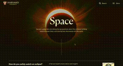
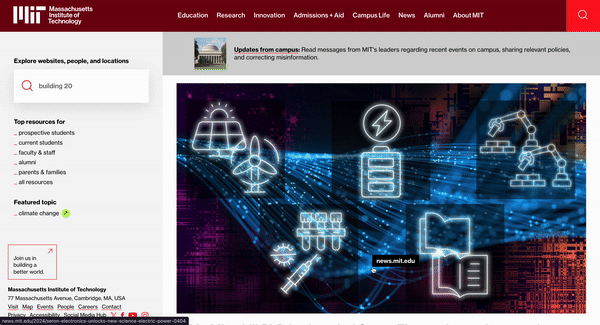
Competitive Analysis
Harvard
User Interface
Clarity of Information
Navigation
-
Simplify menu structure.
-
Implement predictive search.
-
Optimize mobile navigation.
-
Blend tradition with modernity.
-
Enhance engagement with interactivity.
-
Optimize visuals for diversity.
-
Streamline content.
-
Prioritize key information.
-
Optimize navigation.
Clarity of Information
Navigation
-
Maintain consistent navigation.
-
Consistent patterns, progressive disclosure, intuitive gestures.
-
Maintain clean, modern design.
-
Incorporate dynamic elements.
-
Ensure consistency in branding.
-
Ensure clarity amidst diversity.
-
Employ consistent formatting.
-
Utilize progressive disclosure.
User Interface
Stanford

Clarity of Information
Navigation
-
Accommodate varying user familiarity
-
clear calls-to-action
-
contextual cues
-
Simplify while maintaining functionality.
-
Integrate engaging multimedia.
-
Prioritize accessibility.
-
Streamline navigation
-
use visuals
-
guide users effectively.
User Interface
MIT
Understanding user's perspective
The user survey, garnering feedback from 20 users, aimed to delve into users' initial impressions, past engagements with the Yale School of Art website, their satisfaction with its usability, inclination to recommend it, and their preferences and concerns regarding the available programs.
Specific tasks for the survey:
Find Admission Requirements for MFA Program
Register for a Campus Tour
Concerns raised
Unclear website structure hindering information access.
Broken links
Limited accessibility features
Exclusion of users with disabilities
Difficulty finding information
Unclear website structure
Information overload
Limited multimedia content
Ideating and Sketching
How can we enhance the system while minimizing disruption for existing users?


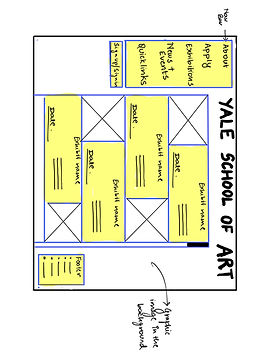
The goal was to create a solution that worked well for both old and new users. I made sure everyone could easily find information about different courses while still keeping the editing options familiar for all users, like on wiki websites. I simplified the design by sketching out basic user flows and wireframes, making sure not to make big changes. I focused on making things easier to understand, organizing things visually, and getting rid of anything unnecessary. This way, both long-time users and newcomers could navigate the platform smoothly.
Information Architecture
Developing a refined information architecture for the Yale School of Art website was essential in the redesign process. By examining the existing user flow and iteratively iterating upon it, we aimed to enhance user experience by identifying and addressing navigation challenges while ensuring alignment with the institution's goals.

Incorporating Changes
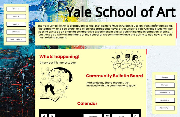


On the homepage, I improved the visual hierarchy while maintaining the existing visual language and preserving the essence of the wiki site concept.
Simplified the menu structure and introduced intuitive navigation paths to help visitors easily find relevant information and artworks.
The footer was rearranged to facilitate simpler navigation, while the layout was enhanced for increased clarity and reduced clutter.


Implemented increased spacing between elements and optimized typography to improve readability and ensure that the background image does not overshadow the textual content, creating a balanced and visually pleasing browsing experience.
Introduced interactive pop-up windows for quick access to introductory information about exhibitions or collections, reducing monotonous scrolling and providing users with immediate insights into featured content.
Enhanced the exhibition pages by incorporating visually engaging content such as images, videos, and interactive elements, effectively establishing a stronger connection between the visuals and the theme or content of each exhibition.
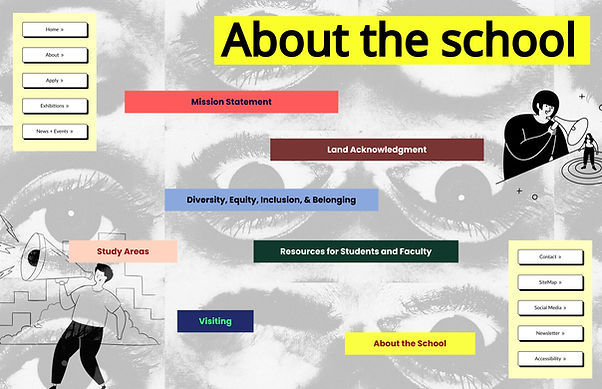
Implemented a categorization system to organize information into distinct groups, enhancing clarity and making it easier for users to navigate and find relevant content on the website.
Utilized Gestalt principles to segregate information effectively, enhancing visual clarity and improving the overall user experience by leveraging principles of proximity, similarity, and closure to create cohesive and organized content groupings.
Solution
Before

After