
Data Visualization | Graphics Design
What's your grape escape?
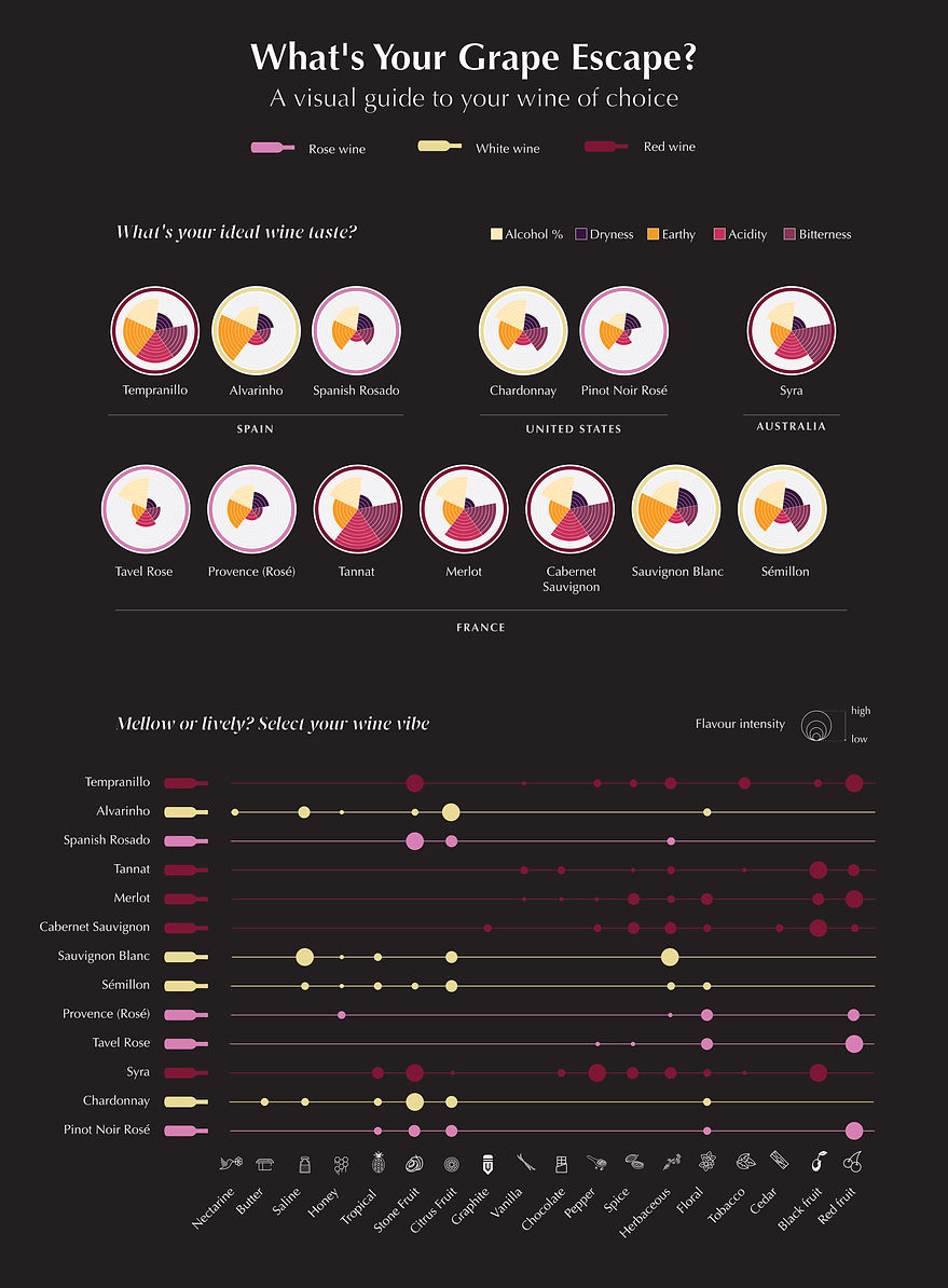
We've crafted a user-friendly wine flavor profile visualization using visual cognition techniques. This tool distills wine complexity into five core traits—acidity, tannin, alcohol content, earthy notes, and dryness—making it easy for even novices to understand and compare different wines. It empowers users to choose wines that match their taste preferences, democratizing wine appreciation for all.
Why would anyone use the graphic?
Let us understand this with a user's example.
That looks like a nice wine shop. Lets go try!

Well, I don't know a lot about wine. It's either red, white or rose. How will I know which one will I like?
I like the citric flavor, but the wine should be a little dry and sweet. How will I understand which wine will have these flavors and traits?
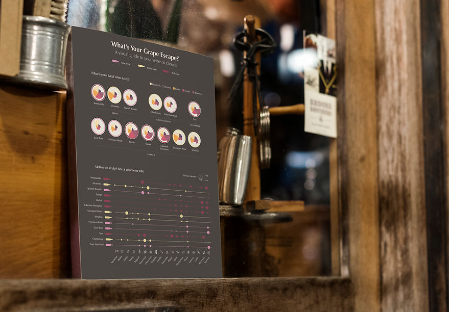
Oh wait! They have some nice poster here. Let me check!


I have planned to go on a solo trip to Spain. Finally, my dream has come true
Hi, I am Anna.

My friends recommended trying some nice local wines
What were some important design decisions made to achieve the goal?
The encodings on the poster talk about the flavor profile of the wines the store houses. Immediately she is able to shortlist wines that are light and medium dry, with high acidity. Since she likes citric wines, she then uses the visualization to check the different flavors the shortlisted wines have and selects the Alvarinho with Lemon Zest (citrus). So, even with no knowledge of what Alvarinho is, Ana was able to make the selection based on the flavor profile as identified using the visualization.
1. Color palette selected to depict the shades of wine
2. Attention was paid to ensure enough contrasts to avoid an overlap especially in representing red and pink wine
3. Gestalt’s law of past experience: the colors selected to represent the 3 main categories of wine itself reflect the true shade that wine is available in to enhance a visual connect.


